Toolkit Overview : Define : Plan : Gather : Preserve : Metadata : STORYTELLING : Share : Recommendations
STORYTELLING with VIDEO COLLECTIONS
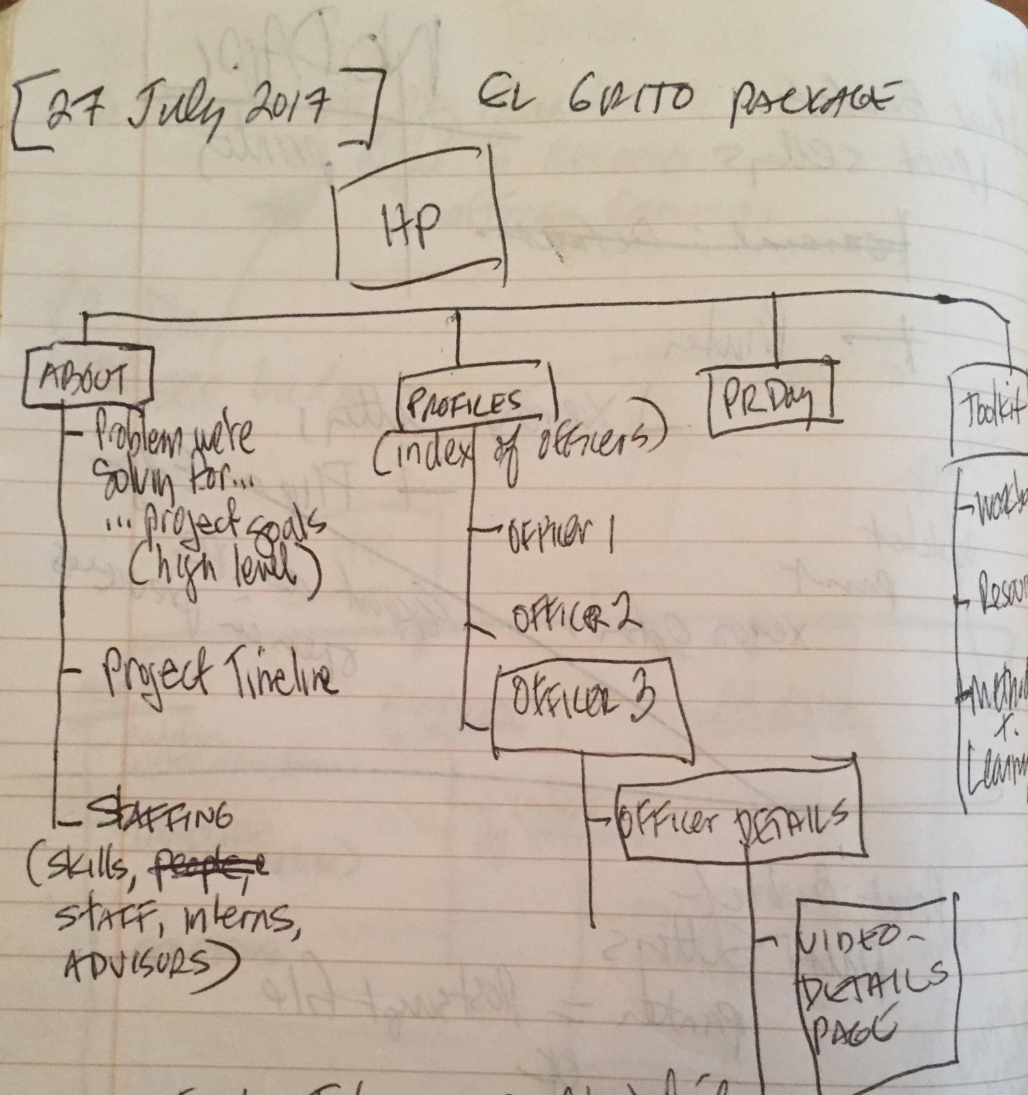
EL GRITO DESIGN NOTEBOOK
Finding the stories in eyewitness video collections
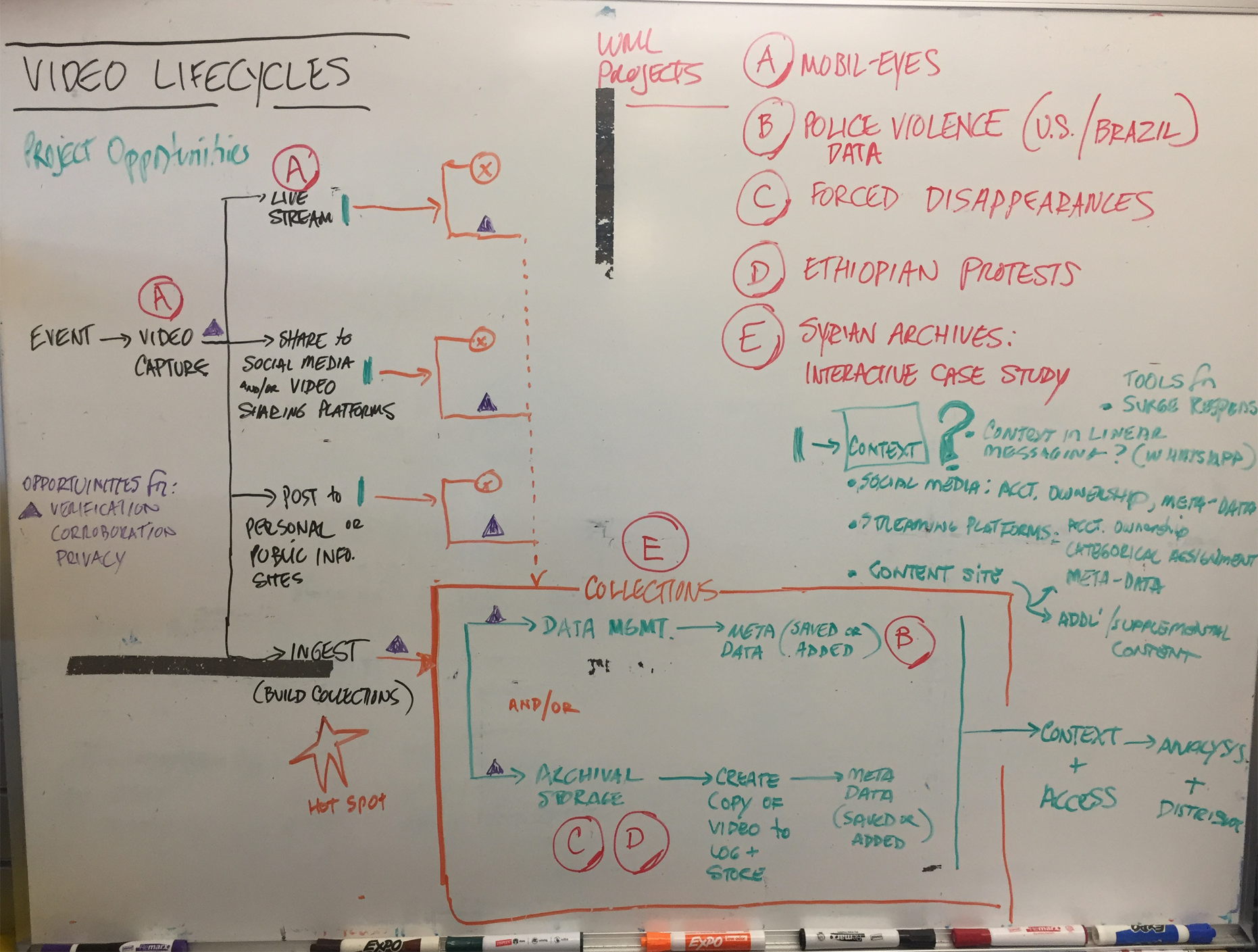
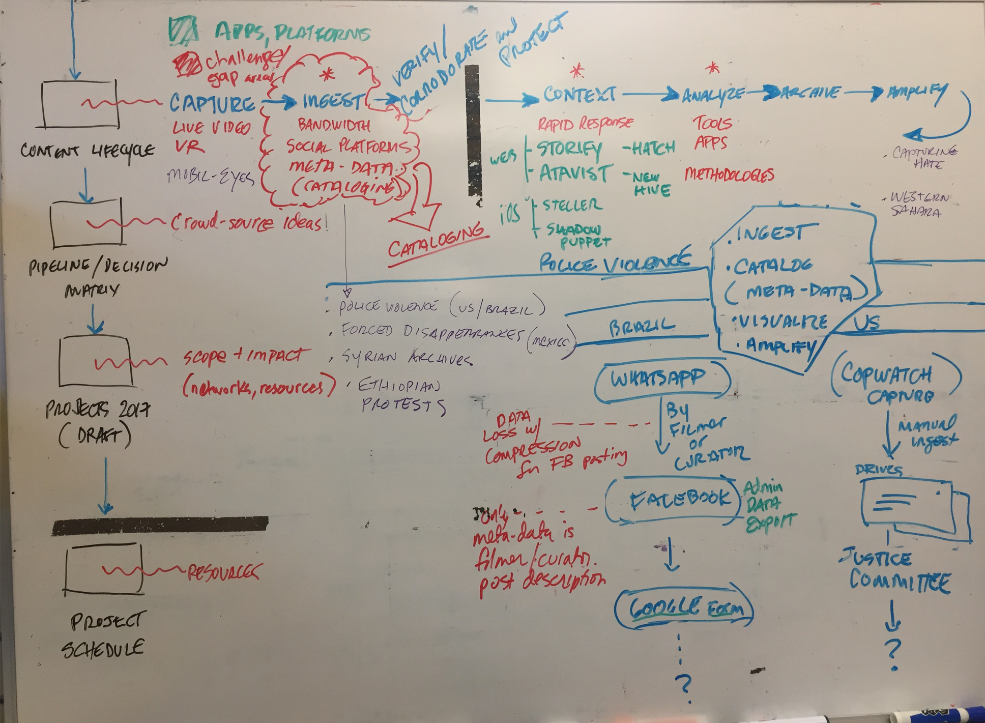
BRAINSTORMING
We first consulted with the WITNESS program managers to better understand the challenges of managing, and storytelling, with a constantly growing repository of video assets.
Across region and human rights issues, we found common threads:
- Organizing and archiving videos is labor intensive
- Looking for ways to create archives quickly for raising awareness, without compromising the integrity of the asset for legal proceeding
- High impact storytelling requires design resources that aren’t available to many organization
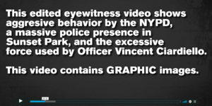
Just a few weeks into logging and describing videos — and consulting with activists and organizations working on similar police accountability projects — we landed on the idea of creating “dossiers” for each of the serial abusers in our sample.
RESOURCES
![]()
A crash in Design Thinking, resources to help you facilitate a 90 minute design challenge.
NOTES from OUR DESIGN SESSIONS
CONTEXT
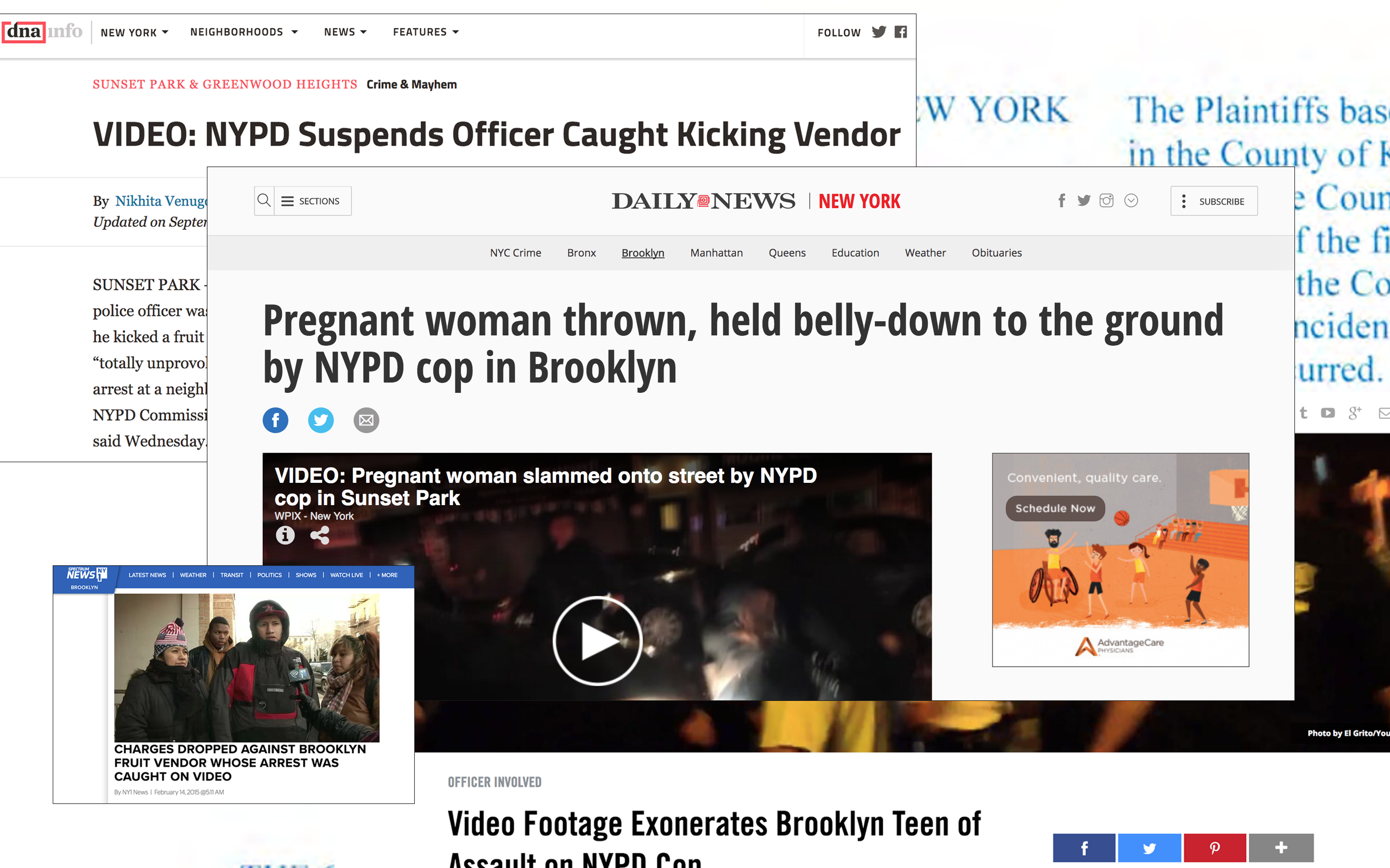
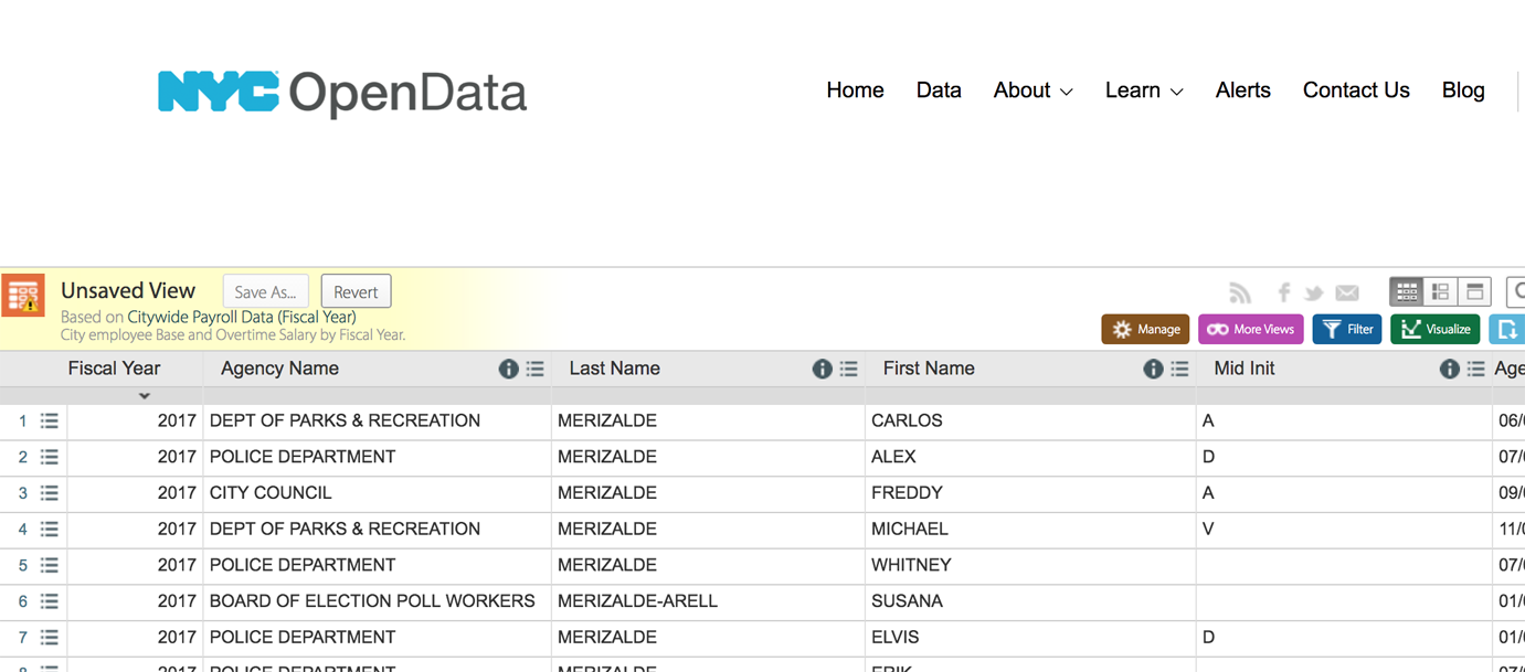
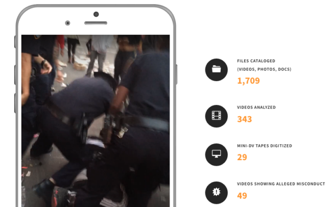
As a part of the meta tagging process, we researched each recorded incident for corroborating content.
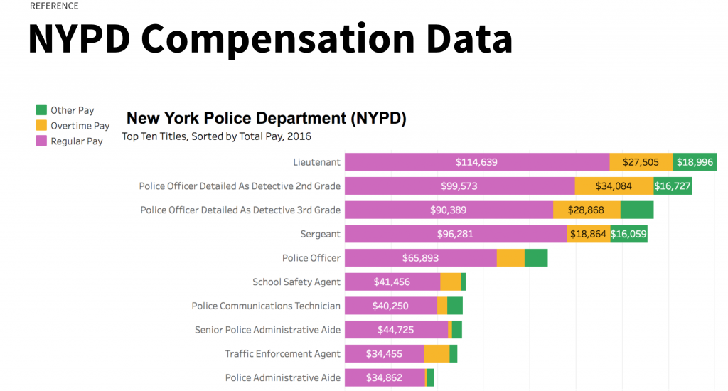
We found that despite the public awareness of the abusive encounters, very little in the NYPD practices reflected that information. On a few occasions, generally when cases reached a high profile because of the video documentation, officers were disciplined and called out publicly.
Recognition from elected officials, salaries that exceeded departmental averages, and extensive overtime were commonplace.
Some of the sites that we found most useful:
SOURCES OF ONLINE DATA
ILLUSTRATING OUR FINDINGS
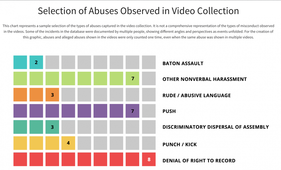
After watching, annotating and logging the videos and associated research, we found:
- Abusive behavior by the officers we studied occurred year after year
- Despite documented history of abuse, negative media, legal proceedings, and videos showing violent acts — these abusive officers were being rewarded by the NYPD with regular raises, most greatly exceeding departmental averages.
- Officers routinely misstate or interfer with the community’s right to record police activity
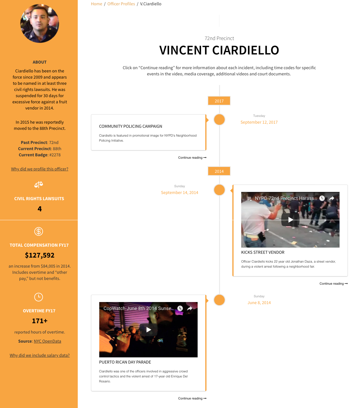
Incident Timeline
To show ongoing abuses overtime in the context of other data points, especially compensation & reward — we put each video and other events on a timeline. The adjacency shows a disconnect between professional behavior and departmental rewards.
Our prototype is meant to show how stories could be not only crowd-sourced, but provide information in real time. We decided that a vertical timeline would best feature the most recent events as well as create space to include other data points in adjacency.
To create the timeline in our WordPress prototype, we used a commercial plugin (WP Timeline, $24) that was responsive, supported video play, included both vertical and horizontal timelines, and was compatible with a number of design apps including Visual Composer and Tatsu.
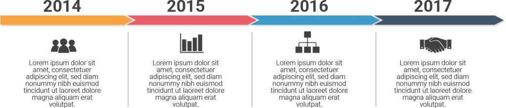
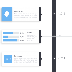
DESIGN SKETCHES for TIMELINE
For quick sketch exercises, we used Freepik.com — a great resource with many free or low cost graphics, images, and icons.

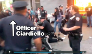
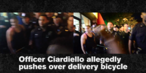
Editing the Videos
It can be hard to make sense of what is happening in videos of police abuse. Events unfold quickly, identifying officers can be challenging and sometimes the camera is shaky or far away.
We decided to edit the videos that appeared in the timeline to make it easier to identify the officers and understand the events as they unfolded, especially when multiple camera angles were available. We used additional documentation such as court documents, testimony and news articles to corroborate our analysis.
If you edit video documentation of police abuse, remember to always work from a copy – never edit the original. Be sure you only include factual information and don’t manipulate the footage to make it look like something happened that did not happen.
STILLS FROM EDITED VIDEOS
VISUALIZING DATA POINTS
Human beings process visual data better than any other type of information. The human brain processes images 60,000 times faster than text, and 90 percent of information transmitted to the brain is visual.*
With that in mind, we created minimal, illustrated data points, to quickly convey our findings.
ABOUT THE VIDEOS
Using Existing Graphics
Data visualizations are becoming the norm. We found several that supported our narrative.
SOURCE: Citizens Budget Commission
Resources
We used the following applications, platforms, and graphical resources to create our prototype.
 WORDPRESS
Open source content management system.
COST: $0
WORDPRESS THEME
Multi-purpose theme from Oshine with many pre-built demos, and drag-and-drop page builder to add functionality without needing to code.
COST: $49
OMNIGRAFFLE
For workflow, sitemaps, and wireframes we the Mac-based application Omnigraffle. Its robust digital asset library is good resource for non-designers.
COST: Free 14 day trial; $99
ADOBE PHOTOSHOP
Photo editing, presentation graphics.
COST: Free 30 day trial; $19.99 per month or $49.99 for complete Adobe Creative Suite
ADOBE ILLUSTRATOR
Charts, graphs, logos & icons
COST: Free 30 day trial; $19.99 per month or $49.99 for complete Adobe Creative Suite
ADOBE INDESIGN
Workbook and worksheet layout and design.
COST: Free 30 day trial; $19.99 per month or $49.99 for complete Adobe Creative Suite